Overview
In this Directed Studies case study, I explored DailyHive's web interface, specifically the impact of news filtering and navigation on sorting ease. The purpose of the study was to analyze current DailyHive interface to understand user engagement on their news navigation experience.
timeline
Week 1: Framing of Research, searching for suitable resources
Week 2: Research start
Week 3: Heuristic Evaluation
Week 4-6: Building the survey
Week 7-9: Launch Survey, gather participants
Week 10: Summarize survey results, final process document
Week 11-12: Redesign of DailyHive website
Spring 2022 - 12 weeks
The challenge
Compared to its other competitors such as CTV News, The Province, and Vancouver Sun, the navigational structure of DailyHive's website needs to be reorganized as the website has the same interface as mobile. Browsing habits and needs of the users are different on mobile and web, hence the interface must be designed differently.
research
As a news website would be too broad to explore, I researched and referred to various sources that could help narrow down the topic. I took note of important information and eventually narrowed down the focus area to navigation and news discoverability.
Research Notes on navigation - Local Navigation Is a Valuable Orientation and Wayfinding Aid. (2021, July 4). Nielsen Norman Group.https://www.nngroup.com/articles/local-navigation/
Research Notes 2 - Hamburger Menus and Hidden Navigation Hurt UX Metrics. (2016, June 26). Nielsen Norman Group. https://www.nngroup.com/articles/hamburger-menus/
HEuristic evaluation
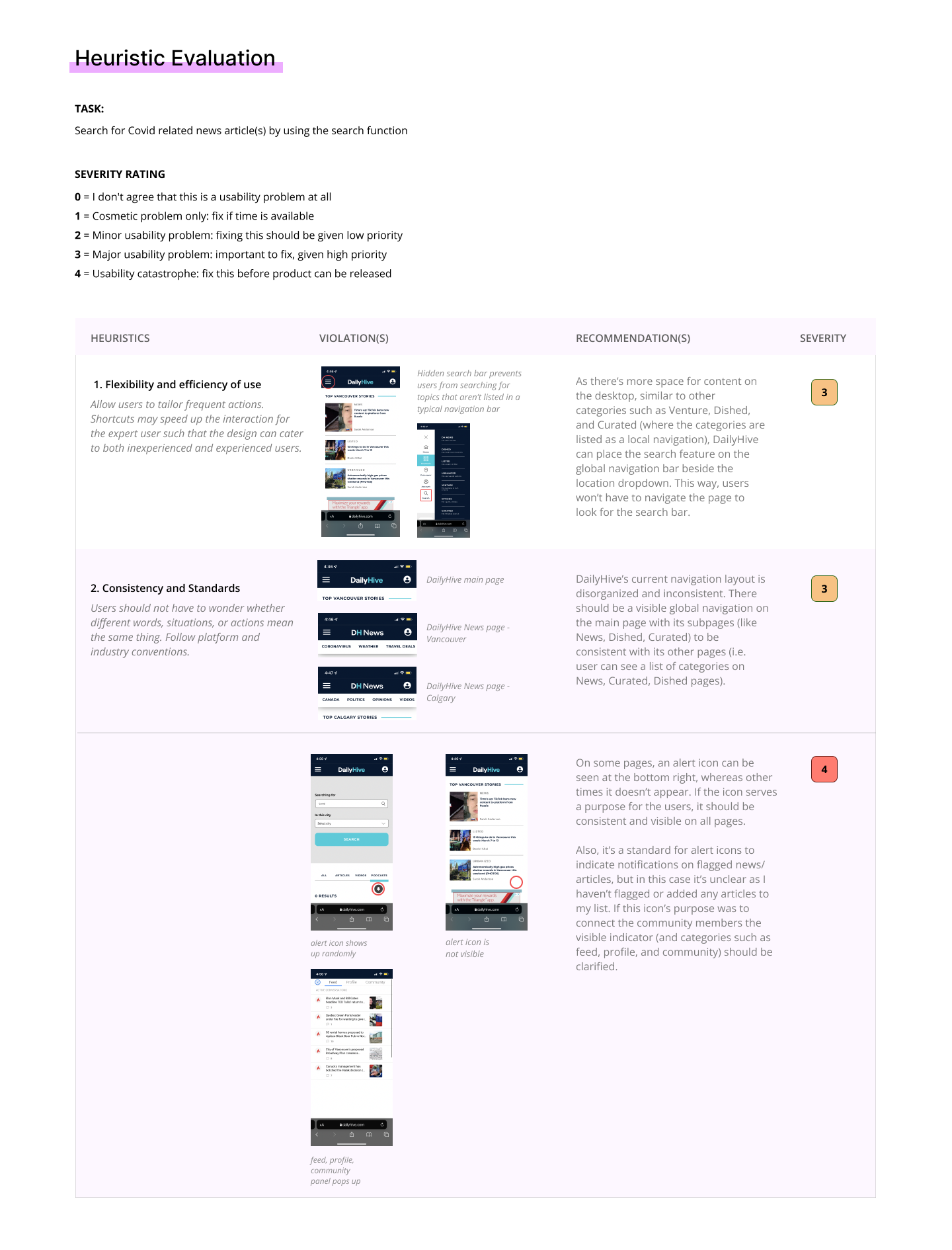
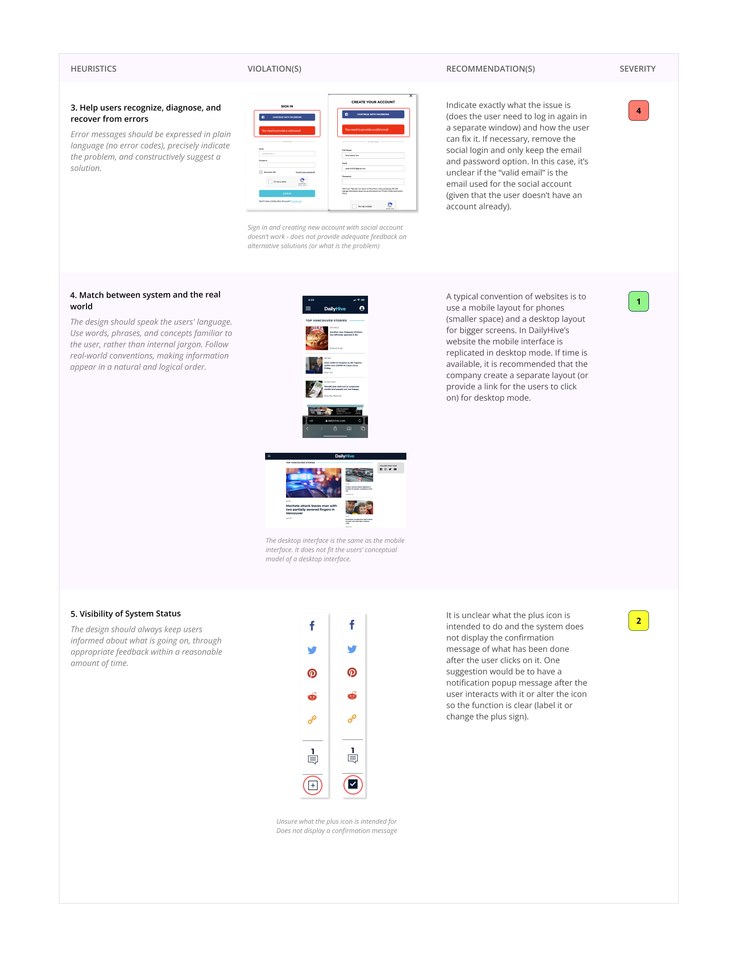
The following heuristic evaluation was conducted by me using Figma, through referencing Nielsen Norman Group’s 10 Usability Heuristics for User Interface Design.
Below are the heuristics used for the evaluation:

preparing a survey
Before creating a list of questions for the participants, I thought about what information I wanted to attain from the survey.
What do I want to know?
What features are the most used or relevant and why?
Do users use DailyHive for exploratory browsing or do they have a specific type of information they’re looking for?
Keeping in mind some survey guidelines, I came up with a question bank.
I picked the questions to understand the typical usage for DailyHive users and a general sentiment of why they read or access DailyHive. Other reasons were to learn more about the features that they use the most and why they use them (as well as features that were not included as an option). The last question was used to gauge user opinions and attitudes about DailyHive. The 5 options allowed me to quantify the information that is easier to understand.
Survey Results & OBservations
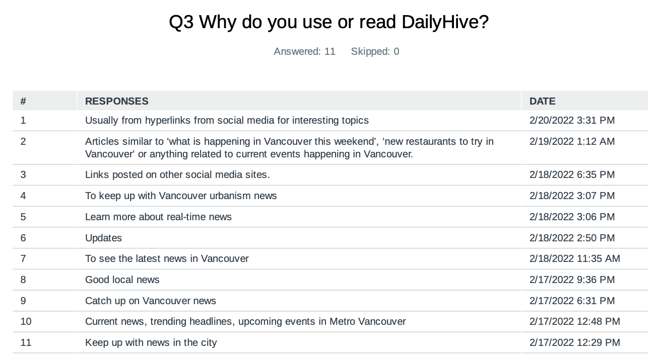
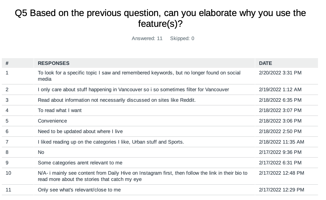
The survey had 11 responses in total.
• One area that could have been explored further is how users approach or enter DailyHive.
• Features such as news commenting and weather were not used by the users.
• News categories and filtering options were easy to use and useful, while finding old news articles that they wanted to view again was perceived to be more difficult.
• Some users already had keywords or articles in mind that they were interested in before coming to the website, while most looked for more exploratory browsing.
• As most users spent 1 min to 10 min on the website, it is critical that menus, news pillars and popular topics are easily accessible and visible.

Reflections
The case study allowed me to understand DailyHive's users a little better. As there weren't many primary research resources available about news website navigation, as well as lack of access to DailyHive website stats and users, it was a bit more challenging to gather research findings before choosing what to focus on and starting on my redesign. If I were to continue with the research, I would conduct a focus study (maybe 3-5 users) and pick one task that I could observe while the user completes the task. I would also consider conducting an A/B test to observe if the redesign is effective at finding information, compared to the current website.


